Into the blue


The Wikipedia says: Blue is the “Colour” of the clear sky
and the deep sea.

On the optical spectrum, blue is located between violet and green. Indigo and ultramarine, closer to violet; pure blue, without any mixture of other; Cyan, which is midway on the spectrum between blue and green, and the other blue-greens turquoise, teal, and aquamarine.
Lapis lazuli, cobalt and azurite, were the originators of
the blue pigments, and the plants woad, Indigofera tinctoria, true indigo were
used to produce the blue dies.

The Blue Period of Pablo Picasso, the blue jeans, the blue Manolo
Blahnik heels, or the Blue neon lighting are blues from different generations translated and implemented into
everything and everywhere, accessible to all social classes, and all ages; it’s
like somehow, we come together through a color.


How can the blue be a state of mind and represent sadness?
All the happy songs mention blue skies. In some places such as Thailand, blue
is associated with Friday, the best day of the week, TGIF!!!

Blue stripes on a traditional Jewish tallit, Vishnu or the
supreme god of Hinduism is often portrayed as being blue. The Bhaisajyaguru,
Buddha of healing traditionally, holds a lapis lazuli jar of medicine. In the
Islamic World, blue and turquoise tile traditionally decorates the facades and
exteriors of mosques. In Catholicism, blue became the traditional “Colour” of
the robes of the Virgin Mary in the 13th century.

What is your blue?
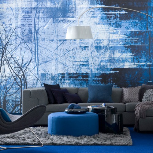
Blue is a very popular color among designers’ color schemes.
Interiors with a little splash of color or a wild combination between vibrant
primary colors are very popular in the interior design world. Living Rooms,
kitchens, Bedrooms, baby nurseries, and bathrooms, the sky is the limited and
the creativity goes above & beyond.
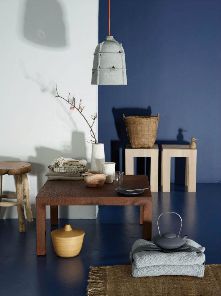
When using a large amount of a bright color blue, the dark
accents are better off in a small scale or containing very thin lines.

Blue is the "colour" of light between violet and green

Ultramarine, the most expensive blue during the Renaissance is a slightly violet-blue
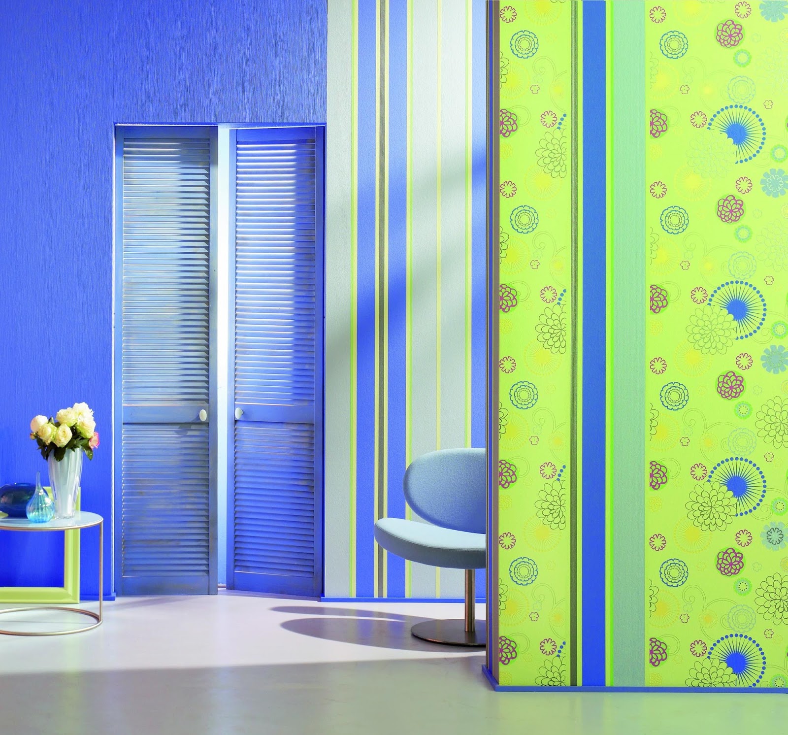
The green and blue stripes add movement to the walls, creating a fun environment, perfect for the kids rooms.

Frequently used for painting skies, the Cerulean blue
pigment was invented in 1805, but only marketed in 1860.

Chocolate & Blue

splash of color

French flavors, Pink Toile & blue
The headboard upholstered with a 16th century French pattern
looks amazing with the blue wall.
Who says girl’s room can’t be blue?

Mondrian

Bright colors = happy rooms

The nature & the blue, very sudden.

The new old fashion way

Baby Blue & Baby yellow

Perfect combination, there goes to show that patterns and
colors don’t fight, this room has the right amount of both, with enough splash
of blues throughout the space not even the dark color chevron pattern drapery, doesn't overpower the room. Everything in moderation is good, the same goes for your
living room.

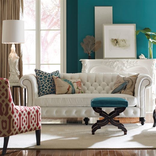
Neutral colors, blue & red

Blue & Blue

Many blues...many hues

This is a great idea for rooms with a very long wall, it
gives distinction between two adjacent spaces.

Dress it up your corridor with a beautiful wallpaper, large-scale
patterns, such as damask and metallic accents are a great options.

One piece of furniture in the room with a distressed finish can bring a little rustic flavor without overdoing it.
I hope your favorite is a very happy blue :)